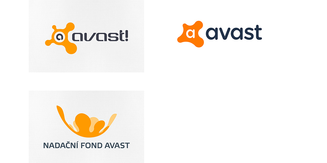
The evolution of AVAST logo
Our goal was to update the AVAST Foundation logo according to the AVAST rebranding process which is happening at the moment; thus we applied the new color palette and font used in the new AVAST logo. In order to keep the Foundation’s style and visual effect, we maintained the same symbol and updated it based on the new shape and flat design style.
Applications
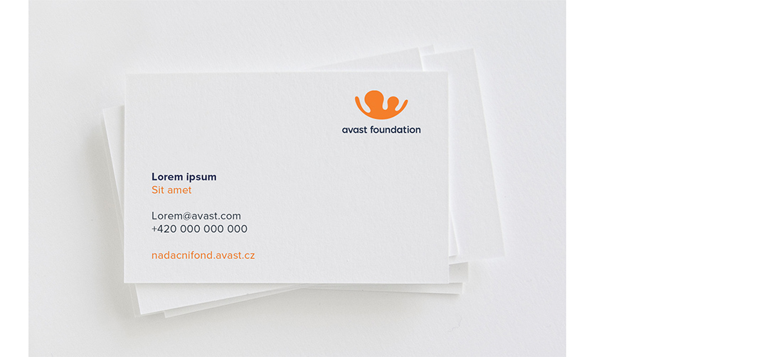
The logo redesign includes both the English and Czech versions. Along with this, we also developed a style guide and stationery, including business cards, letterheads, envelopes, and some merchandising items.


Avast Foundation
New website
In addition to the logo, we also redesign the website, aligning it with the new design language. The update incorporates a fresh color palette, large images, and clear, concise text to highlight the foundation’s functions and programs.
This approach ensures a visually appealing and user-friendly experience that effectively communicates the foundation’s mission and initiatives. Another task was creating the iconography for the foundation’s programs and website.


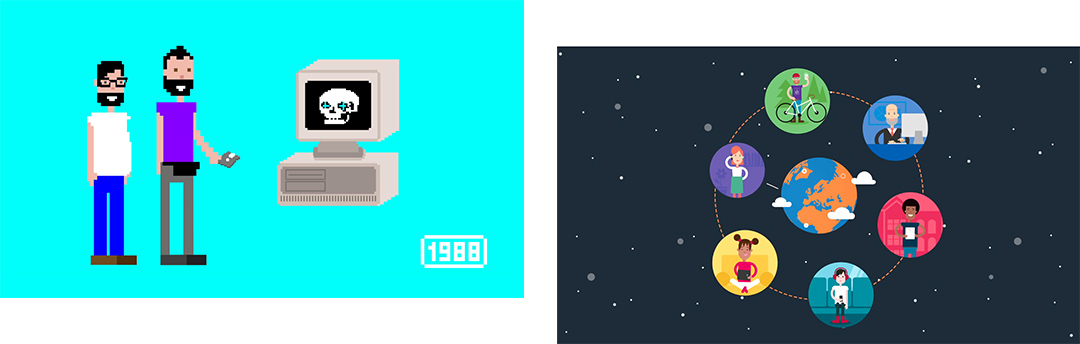
Animations
We also created several animations for the foundation. Here, you can see some examples.
Related 30th anniversary of Avast Antivirus — One World festival Campaign