
Abakus foundation Branding
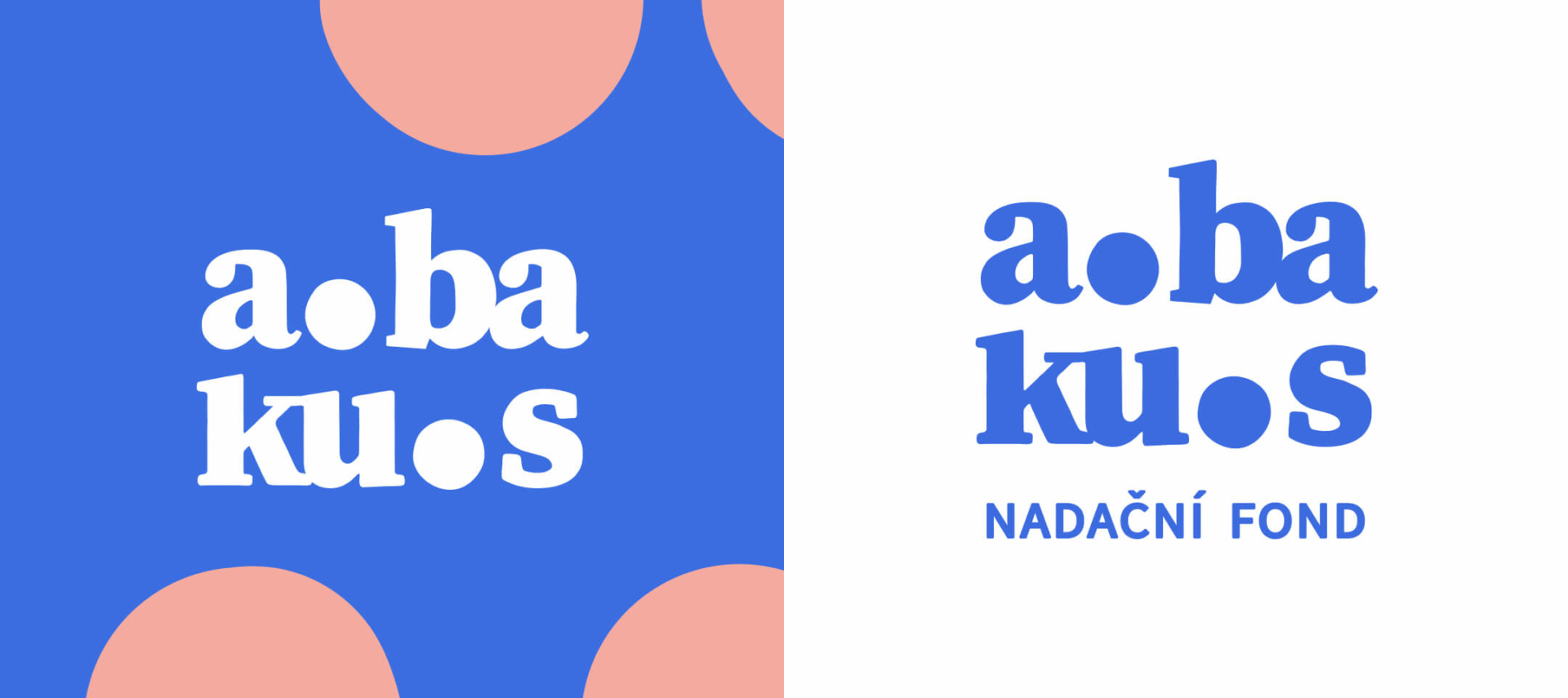
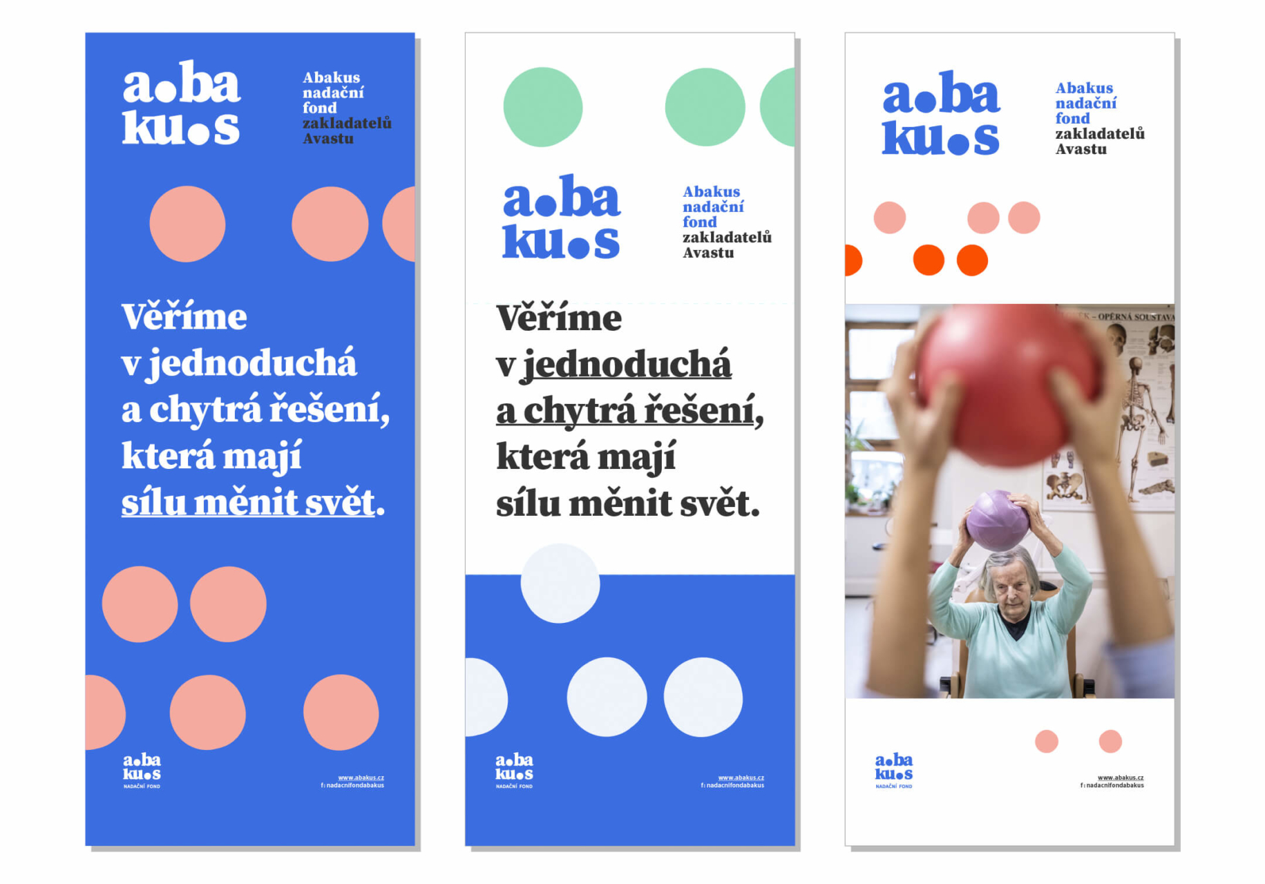
Branding for a new Czech foundation called Abakus. The word “abacus” comes from an ancient numerical table, the first computer, and symbolizes the search for effective solutions available to all. The visual identity is inspired by this counting tool and uses rows of dots as a principal visual element. The logo uses an extra bold serif font and works with the motif of an excessive dot – an element which, apart from the balls of the abacus, functions as a symbol expressing cohesiveness and togetherness.
Client Nadační fond Abakus


Visual communication
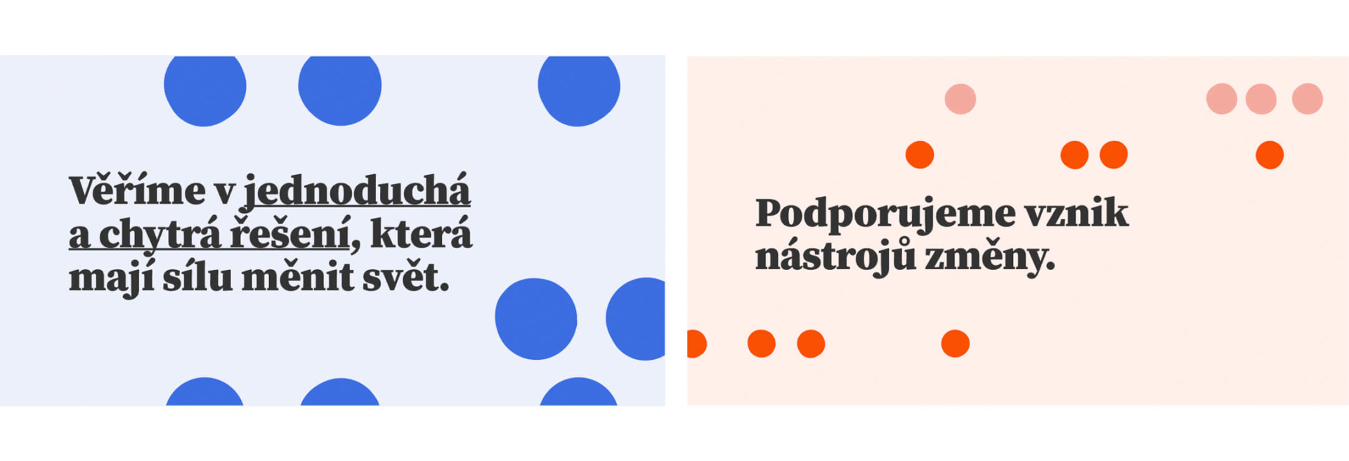
Thanks to the main visual recourses, dots and colors, it is possible to make countless combinations and patterns, which makes this branding very playful and gives us many possibilities to produce diverse applications for many years to come. It can be easily combined with photography and illustration.


Web design
We designed a simple and elegant landing page, that works as a brief and provisional introduction to the new foundation.

tags:
logo