
DUHA Association
Rebranding
DUHA, Social services for people with mental disabilities
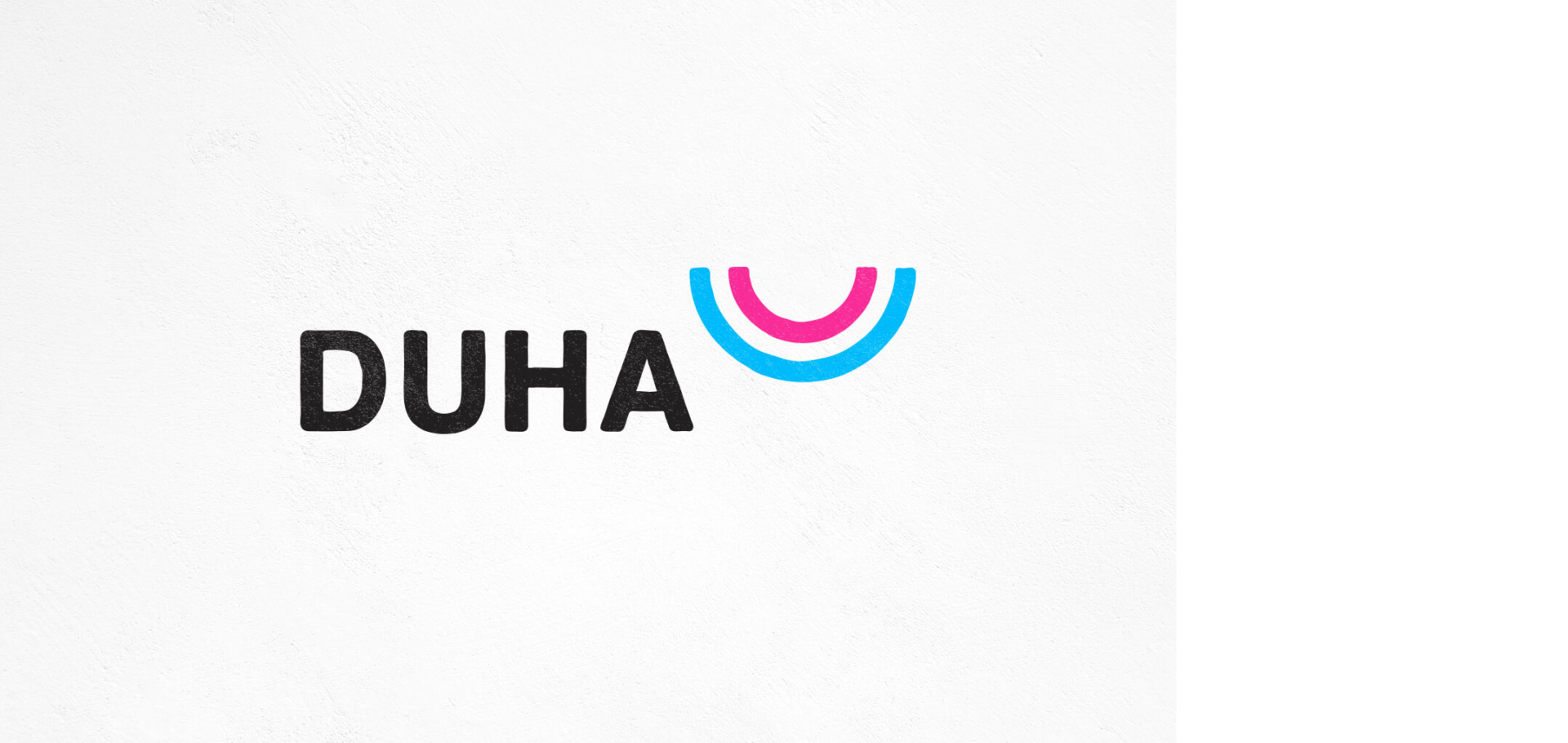
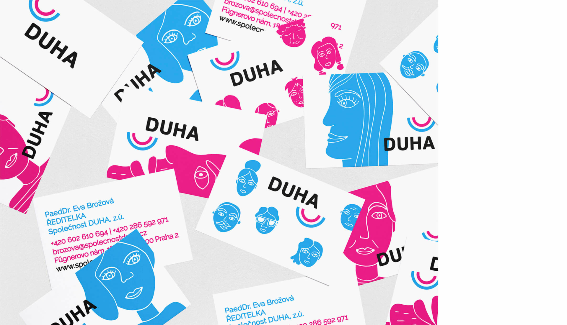
DUHA’s mission is to work with adults with mental disabilities to expand their capabilities in different areas of life. Our goal is to create an original identity that is modern and clean, but it also has a hint of human touch and imperfection. The new identity avoids both the typical colors of the rainbow and its shape, which turns into a smile (Duha means rainbow in Czech). We use the less obvious colors cyan, magenta, and black. The logo is dynamic and variable, it can be combined with illustrations that express home, respect, relationships, or self-realization … In general, the new visual works with differentness and extraordinariness, just like DUHA.
The typography is subtly uneven, recalls handwriting that evokes working with people. Work with difference and ingenuity, like DUHA.
Client DUHA Association
Secundary Elements
Illustrations
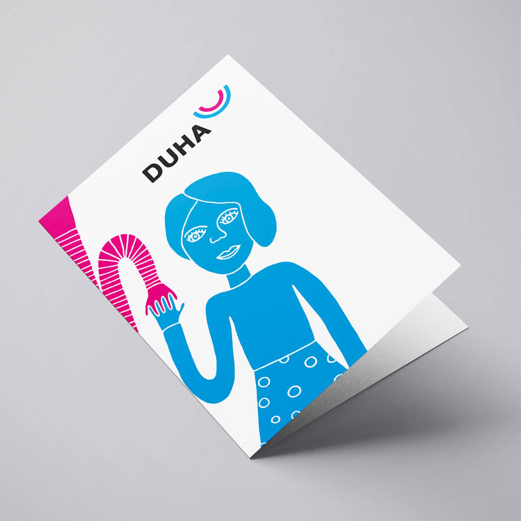
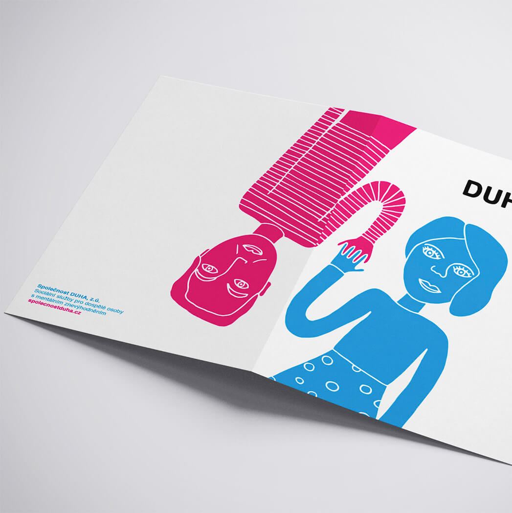
We have generated a graphic style based on friendly and simple illustrations to accompany the brand and humanize it. We wanted to reflect, that DUHA works with adults with mental disabilities in order to expand their opportunities in life.
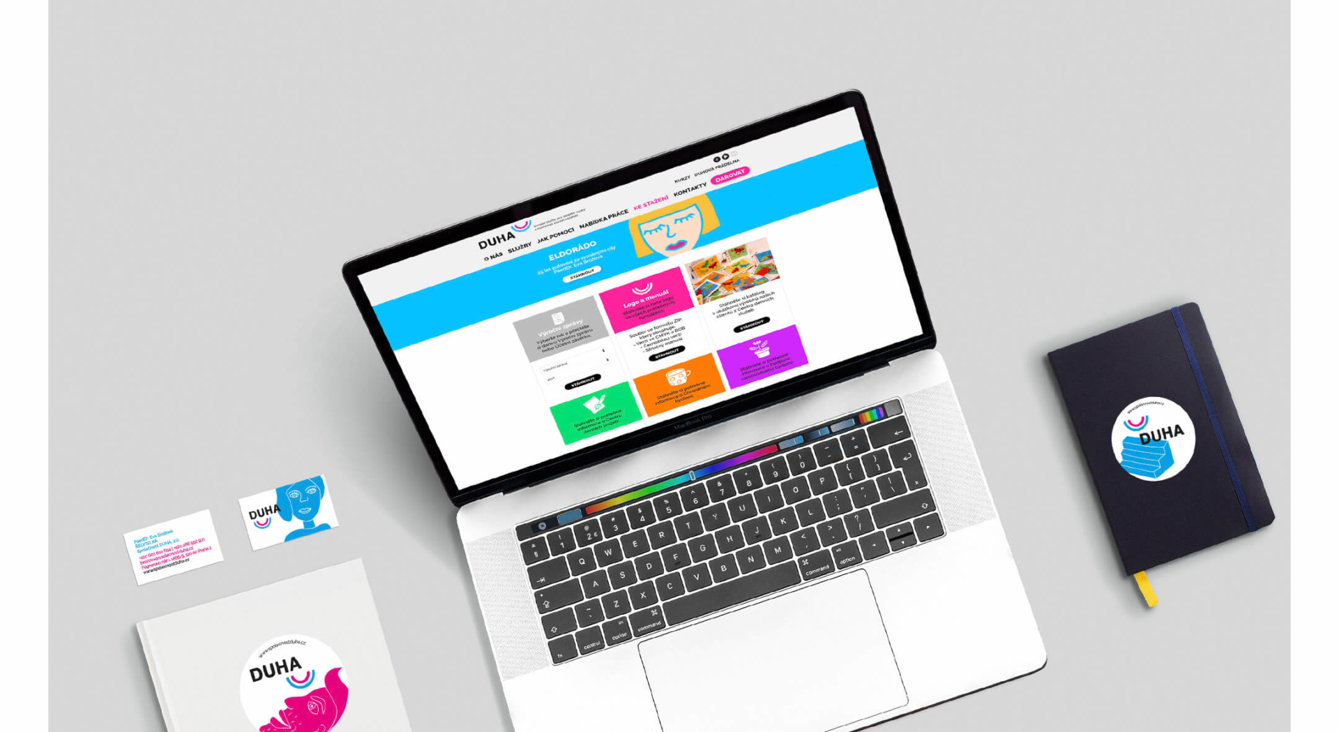
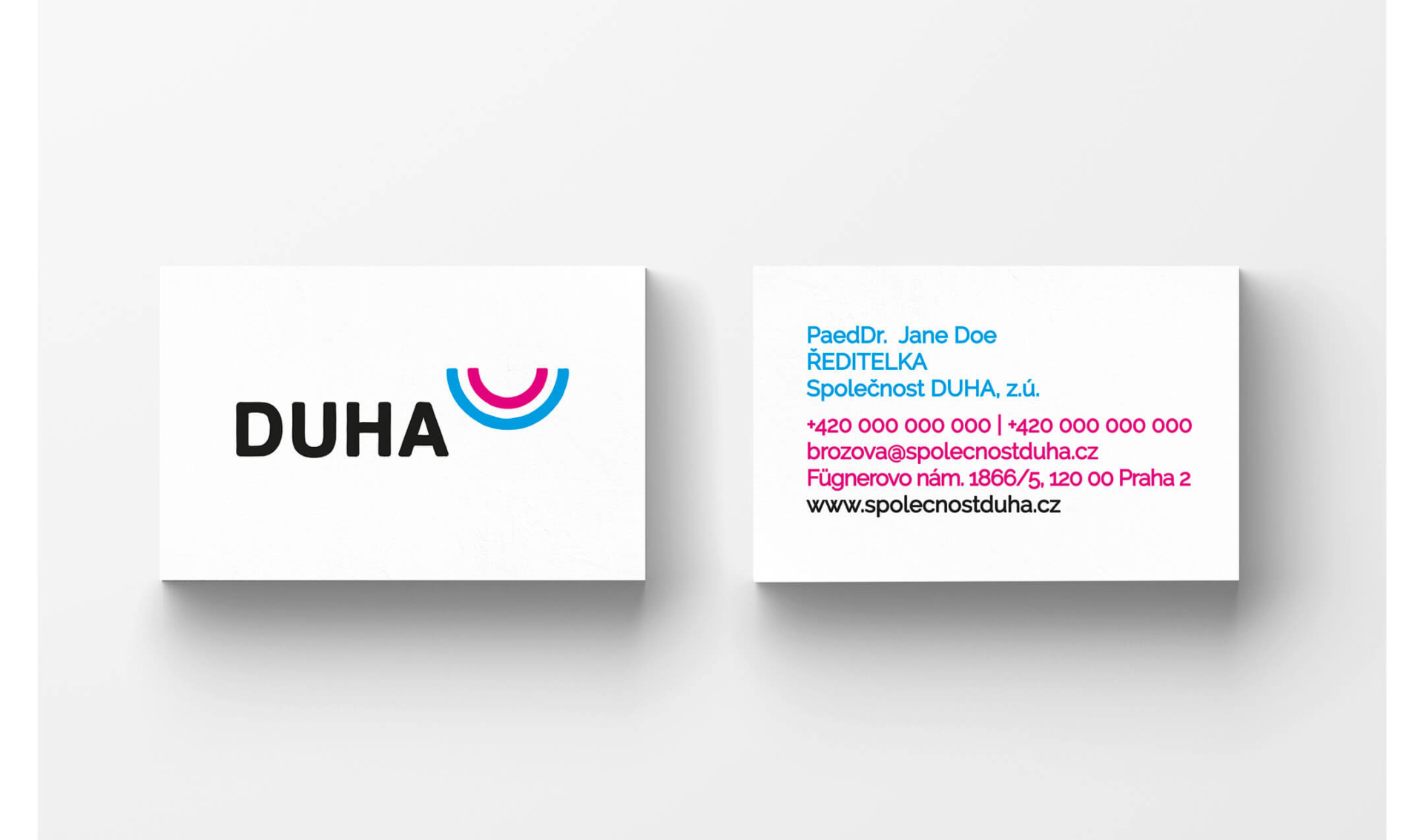
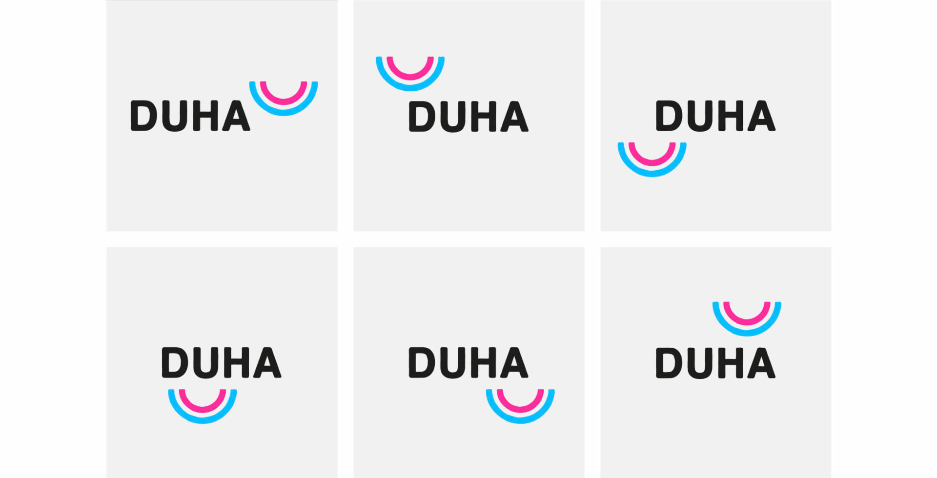
To make the logo more playful, we have established several positions of the icon around the logo. In this way, we obtain a dynamic and adaptable brand to combine with the illustrations. From here we have developed various applications, such as business cards, dossiers, stickers…
Website
Based on the new visual identity, we have designed a website, using not only the two main colors but also creating a new color palette for different sections. The result is a very colorful and clean web, full of illustrations to accompany the texts.
